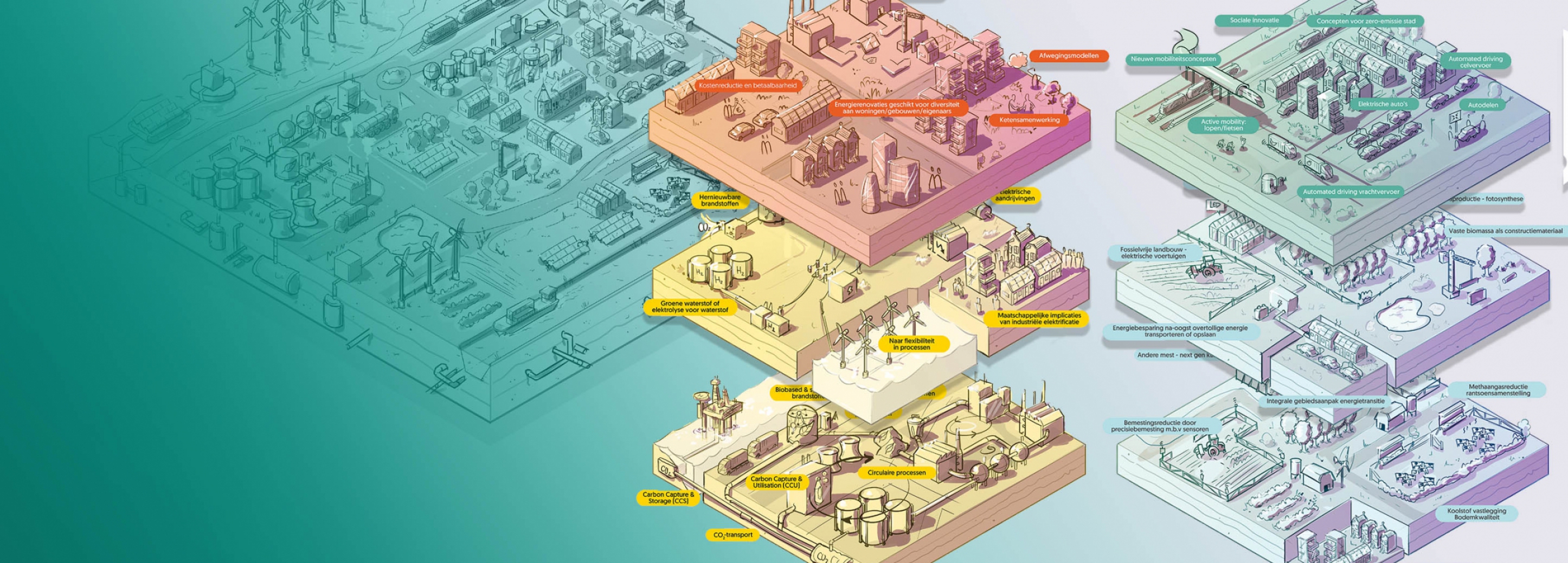
The Energy Top Sector is an important player in innovations in energy transition and sustainability. We made the playing field and the missions clear in an interactive visualization.
Entrepreneurs, researchers, education, social organizations and governments are working on techniques and methodologies to achieve climate goals. With the latest insights, technologies, solutions in design and use, Energy Top Sector wants to connect energy innovation to solving challenges in society.
In order to clarify this for all the different parties involved, the organization asked Flatland to make the playing field visible.

Energy Top Sector
A huge sustainability challenge lies ahead
This requires innovative and organizational capacity with new and existing technology. The transition is not about the technologies and methodologies themselves, but above all about making them applicable for social goals. To keep an eye on social challenges, the Top Sector established Multi-Year Mission-Driven Innovation Programs (MMIPs).
But what exactly does everyone understand by the programmes, missions and themes?

Collaboration between experts requires a common language
Top experts are involved in all innovation assignments; people who have tremendous expertise in a specific area. And with all those specialists, cohesion and a common language are more than necessary. So that the social missions can take center stage and people do not get stuck in their own jargon and methodologies.
We looked for overlap between the wide variety of missions, visions, themes, expertise and jargon. Visualization is a powerful tool to get to a shared image and language. We did sessions with all parties – separately and together – to accomplish 26 visuals and one joint interactive visualization.

Similarities clear by the same format
Everything in the same format was quite a challenge. It seemed like a “round peg in a square hole” at times. Of course it was easier to make separate visuals, but using the same grid makes all the similarities visible. We designed all 26 different themes and missions using the same format. This forces all specialists to use a common language.
Together with all teams we visualized their playing field, and that became an interactive visual. The missions are not put into separate pamphlets, but it has now become one book with several chapters.

Process at least as valuable as result
Very valuable, such a visualization. But our real added value was developing the format together. Because that forced everyone to look at their assignment through a different lens, and to formulate their mission in a simple way. This ensures that all missions and stakeholders recognize themselves and each other better.

Tool remains a living document
But the project is certainly not finished yet. This format provides input for new insights and new collaborations. In this way, the drawings become a tool to continue working with, also in the coming years.
Innovation visible
Discover the different missions- Previous
- Next


Interactive visual

Other Flatland Cases

ProRail - Environment, assets and importance clarified
For this complex operational organization, we clarified all activities, environments and assets. Drawings put departments on the map!

C-ARM - Clarifying change processes
With visual storytelling you tell a story. To explain and clarify a new program and get everyone involved!

Woonstad - Optimizing customer process in a sprint week
How do we improve customer satisfaction of Woonstad residents? In a sprint week we designed the optimal customer journey together.